
Tech
Best Coding Fonts: A Practical Guide for Developers Who Spend Hours in Front of the Screen
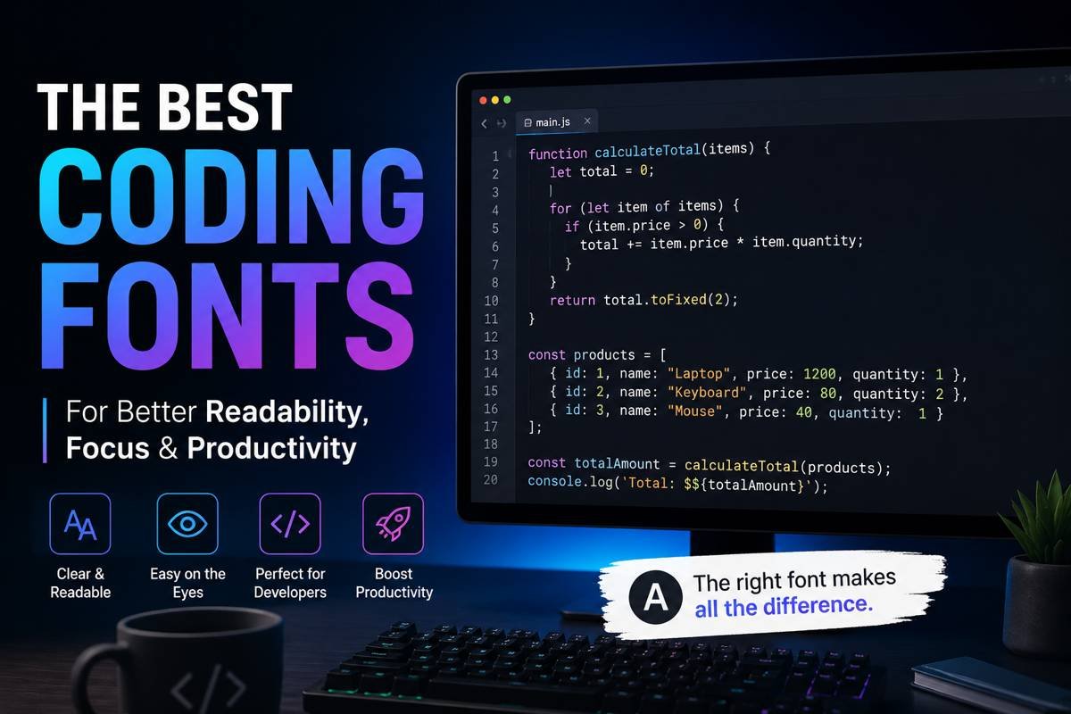
Developers spend countless hours reading, writing, debugging, and reviewing code. While many people focus on hardware, monitors, keyboards, or editors, the font used inside a coding environment can quietly affect productivity, comfort, and readability. A poorly designed font can make similar characters difficult to distinguish, increase eye strain, and slow down workflow during long coding sessions.
The right coding font improves clarity and helps developers stay focused for extended periods. Good fonts make punctuation easier to identify, maintain consistent spacing, and reduce confusion between characters such as lowercase “l,” uppercase “I,” and the number “1.” For programmers who spend most of their day inside VS Code, IntelliJ IDEA, Sublime Text, or terminal windows, choosing the right typeface is not just a visual preference. It directly affects the coding experience.
This guide explores the best coding fonts available today, what makes a font suitable for programming, and how to choose one that fits your workflow.
What Makes a Font Good for Coding?
Not every font works well inside a code editor. Fonts designed for articles, presentations, or branding usually focus on style rather than readability at small sizes. Coding fonts are different because they are built specifically for displaying code clearly.
A strong programming font usually includes:
- Clear distinction between similar characters
- Balanced spacing between letters
- Readability at smaller sizes
- Easy-to-read punctuation marks
- Consistent line height
- Support for ligatures if preferred
- Minimal visual clutter
Monospaced fonts are commonly used for coding because every character takes up the same horizontal space. This alignment makes code structure easier to scan and helps indentation remain visually organized.
JetBrains Mono: A Favorite Among Modern Developers
JetBrains Mono has become one of the most popular choices among programmers in recent years. Designed specifically for developers, it combines modern styling with practical readability.
One reason developers appreciate JetBrains Mono is its large character height. This makes text easier to read without increasing font size dramatically. The spacing between characters also feels balanced, which improves scanning speed during debugging.
Another useful feature is programming ligatures. Ligatures combine symbols such as “=>” or “!==” into cleaner visual representations. While some developers love them and others prefer standard characters, JetBrains Mono handles them elegantly.
The font works well across Windows, macOS, and Linux systems, making it a reliable option for cross-platform developers.
Fira Code: Popular for Ligatures and Clean Design
Fira Code is another highly respected programming font known for its excellent readability and stylish ligatures. It evolved from Mozilla’s Fira Mono and quickly gained popularity among web developers and software engineers.
The main appeal of Fira Code lies in how it displays complex programming operators. Sequences like “>=” or “=>” become visually cleaner, which some developers find easier to process mentally.
Beyond ligatures, Fira Code offers smooth rendering and excellent spacing. The font performs especially well in modern editors such as Visual Studio Code and Neovim.
Developers who enjoy a modern coding environment often prefer Fira Code because it feels polished without becoming distracting.
Cascadia Code: Microsoft’s Modern Terminal Font
Cascadia Code was introduced by Microsoft for Windows Terminal and Visual Studio environments. Since its release, it has earned a strong reputation among developers looking for clarity and comfort.
One of its strongest features is readability on high-resolution displays. The font remains crisp even during long sessions, making it a comfortable choice for full-time developers.
Cascadia Code also supports ligatures and offers multiple variations, including versions without ligatures for developers who prefer traditional formatting.
Its clean structure works especially well for backend development, scripting, and terminal-heavy workflows.
Source Code Pro: Simple, Balanced, and Reliable
Adobe created Source Code Pro with a focus on professional readability. Unlike some modern fonts that emphasize style, Source Code Pro stays simple and highly functional.
The letters are carefully spaced, and the font maintains excellent consistency across different font sizes. Developers who dislike overly decorative coding fonts often appreciate the straightforward appearance of Source Code Pro.
Because of its balanced structure, it works particularly well for long-form coding projects where readability matters more than visual personality.
Many developers also prefer it for pair programming sessions because the characters remain clear when projected on larger displays.
Consolas: A Classic Choice That Still Holds Up
Consolas has been around for years and remains a dependable option for many programmers. It became especially popular among Windows users because Microsoft included it in several development tools.
Despite newer alternatives entering the market, Consolas still performs well for coding tasks. The characters are highly readable, and the spacing feels natural.
One reason experienced developers continue using Consolas is familiarity. Years of coding with the same font can improve reading speed and reduce distractions.
Although it lacks some of the modern design elements found in newer fonts, it remains practical and effective.
Hack: Designed Specifically for Source Code
Hack is a font created entirely for coding environments. It focuses heavily on readability and aims to improve text rendering across operating systems.
The font features wide punctuation marks and distinct symbols, helping developers identify syntax quickly. This becomes especially useful when reviewing complex JavaScript, Python, or C++ code.
Hack also performs well on lower-resolution monitors, which makes it valuable for developers working with older hardware or multiple screen setups.
Its design balances personality with practicality, offering a comfortable coding experience without appearing overly stylized.
IBM Plex Mono: A Professional and Technical Feel
IBM Plex Mono brings a clean and structured appearance to coding environments. Developed as part of IBM’s broader typography system, it offers a technical aesthetic while remaining highly readable.
Developers who prefer minimalist interfaces often enjoy IBM Plex Mono because it feels modern without becoming visually noisy.
The font handles spacing effectively and performs well across terminals, IDEs, and documentation editors.
For programmers who spend time writing both code and technical documentation, IBM Plex Mono creates a consistent visual environment.
Ubuntu Mono: Comfortable for Long Coding Sessions
Ubuntu Mono was designed to complement the Ubuntu operating system, but it works well across all platforms.
Its rounded appearance gives it a softer feel compared to sharper coding fonts. Some developers find this more comfortable during extended sessions.
The spacing inside Ubuntu Mono is slightly wider than many alternatives, which can improve readability for beginners or developers working with dense codebases.
Because the font feels approachable and less rigid, many Linux users continue to rely on it for daily programming work.
Inconsolata: Elegant and Highly Readable
Inconsolata is known for its elegant appearance and readability. It has existed for many years and remains popular among developers who prefer a classic coding aesthetic.
The font maintains excellent clarity while offering a slightly artistic personality. Unlike overly modern fonts, Inconsolata feels calm and balanced.
Its readability at smaller sizes makes it especially useful for developers working on laptops or compact screens.
Many programmers also appreciate how clean the punctuation appears, particularly when writing languages with heavy symbol usage.
How Font Size and Line Spacing Affect Coding Performance
Choosing a font is only part of the equation. Font size and line spacing significantly influence readability as well.
A font that looks excellent at 16px may feel crowded at 12px. Similarly, line spacing that is too tight can make large files difficult to scan.
Most developers prefer font sizes between 13px and 16px depending on monitor size and resolution. Increasing line height slightly can also reduce visual fatigue.
Testing different combinations is important because coding environments vary from person to person.
Are Programming Ligatures Worth Using?
Programming ligatures remain a debated topic in the developer community. Some programmers love them because they simplify complex operators visually. Others prefer seeing raw characters exactly as typed.
There is no universal answer. Ligatures can improve readability for some developers, especially when working with functional programming languages or modern JavaScript frameworks.
However, developers transitioning from traditional fonts may initially find ligatures distracting.
The best approach is to experiment with them for a few days and decide based on personal comfort.
Tips for Choosing the Right Coding Font
Finding the right font depends on individual workflow, screen setup, and visual preference. A font that works perfectly for one developer may feel uncomfortable to another.
Here are a few practical tips:
Test Fonts During Real Work
Avoid judging a font after only a few minutes. Use it during actual coding sessions to evaluate comfort and readability.
Check Similar Characters
Ensure the font clearly distinguishes characters like:
- O and 0
- l and 1
- { } and [ ]
- ; and :
This can prevent coding mistakes during long sessions.
Consider Screen Resolution
Some fonts perform better on high-resolution monitors while others remain readable on standard displays.
Prioritize Comfort Over Style
A visually impressive font is less important than one that reduces eye strain and improves readability.
Why Developers Keep Changing Fonts
Many programmers switch fonts regularly because coding preferences evolve over time. A beginner may prefer larger and wider fonts for readability, while experienced developers sometimes choose more compact fonts to display additional lines of code.
Project type also matters. Frontend developers, backend engineers, game developers, and system administrators often work in different environments and may prefer different visual styles.
Changing fonts occasionally can also refresh the coding experience and improve focus.
Final Thoughts on Choosing the Best Coding Fonts
The search for the ideal programming font is highly personal, but readability should always remain the top priority. The best coding fonts are the ones that help developers read code faster, reduce visual fatigue, and maintain concentration during long sessions.
Fonts like JetBrains Mono, Fira Code, Cascadia Code, Source Code Pro, Hack, and Consolas continue to dominate developer communities because they balance clarity with usability.
Rather than choosing a font based only on popularity, developers should test several options in real projects and pay attention to comfort over extended use.
A good font may seem like a small detail, but over thousands of hours of coding, it can make a noticeable difference in productivity and overall experience.
More Details : Best Coding Kata Sites: A Comprehensive Guide to Enhance Your Coding Skills
FAQs
1. What is the best font size for coding?
Most developers prefer sizes between 13px and 16px because they balance readability with screen space.
2. Are monospaced fonts necessary for programming?
Yes, monospaced fonts help maintain alignment and improve code readability in most editors.
3. Which coding font is best for beginners?
JetBrains Mono and Source Code Pro are excellent choices for beginners due to their readability and clear character design.
4. Do programming ligatures improve productivity?
Some developers find ligatures helpful for reading complex operators, while others prefer standard symbols. It depends on personal preference.
5. Can changing coding fonts reduce eye strain?
Yes, a readable font with proper spacing and sizing can reduce visual fatigue during long coding sessions.

Hair Systems for Men: Your Complete Guide to Confidence

Why Athletes Trust Oakley Over Other Sports Brands?

AI Glasses for Hands-Free POV: Inside RayNeo X3 Pro’s 12MP Sony Camera

Which Vape Is Good in Germany?

How AI Helps Brands Create Memorable Jingles and Marketing Songs

How to Propagate a Snake Plant Successfully: Simple Methods That Really Work

NASA City Lights: How Satellite Images Reveal the Story of Our Planet

Latest Development Updates of Naval Anchorage Phase 2 Islamabad – What Investors Need to Know (2026 Guide)

How to Read Sheet Music Basics: A Complete Beginner’s Guide

HR Applied Intelligence: The Future of Intelligent Workforce Management

What Is Constructor in Java? A Complete Guide for Beginners

Best Free Screen Recorder for Windows 11 Without Watermark in 2026

Best Wireless Earbuds Under 200 Dollars 2024: Top Picks for Sound, Comfort, and Value

Blemish Remover: What Actually Works in Photo Editing and Why

How to Deploy Keycloak Using Docker

Twisted Games by Ana Huang: An In-Depth Review of the Popular Royal Romance

Carlos Alman: A Closer Look at the Life and Background of Cardi B’s Father

Teach Me First Comic Guide: How Beginners Can Create Their First Comic From Start to Finish

Best Times to Post on TikTok: A Complete Guide to Reaching More Viewers

Why Most Travel Businesses Lose Bookings Before Hello
Hair Systems for Men: Your Complete Guide to Confidence
Why Athletes Trust Oakley Over Other Sports Brands?
AI Glasses for Hands-Free POV: Inside RayNeo X3 Pro’s 12MP Sony Camera
Which Vape Is Good in Germany?
How AI Helps Brands Create Memorable Jingles and Marketing Songs
How to Propagate a Snake Plant Successfully: Simple Methods That Really Work
NASA City Lights: How Satellite Images Reveal the Story of Our Planet
Latest Development Updates of Naval Anchorage Phase 2 Islamabad – What Investors Need to Know (2026 Guide)
How to Read Sheet Music Basics: A Complete Beginner’s Guide
HR Applied Intelligence: The Future of Intelligent Workforce Management
-

 Tech5 months ago
xxx is equal to 2022: A Complete Informative Explanation of a Cubic Equation
-

 Entertainment5 months ago
The Artistic World of Gege Akutami: A Mastermind Behind Jujutsu Kaisen
-

 Celebrity5 months ago
Izzie Balmer Partner: A Deep Dive into the Relationship with Will Hawley
-

 Entertainment5 months ago
Semana Santa 2026: Dates, Traditions, and Global Celebrations